Total Energy Use Down in US, Wind & Solar Up

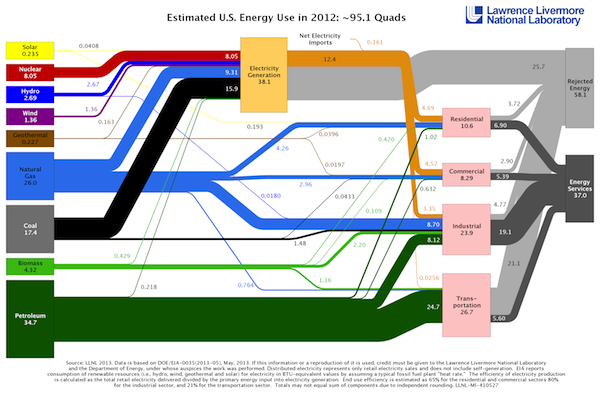
I love those Sankey diagrams showing the energy flows in the US. You can find two versions of them put out by different parts of the federal government. The US Energy Information Administration (US EIA) puts out one type, but it’s not quite as informative as the one that Lawrence Livermore National Laboratory (LLNL) produces. The latest LLNL diagram came out this summer and shows how we used energy in 2012, as you can see below. (To see a larger version along with the 2008-2011 charts, just click the image. It will open in a new tab/window.)
I love those Sankey diagrams showing the energy flows in the US. You can find two versions of them put out by different parts of the federal government. The US Energy Information Administration (US EIA) puts out one type, but it’s not quite as informative as the one that Lawrence Livermore National Laboratory (LLNL) produces. The latest LLNL diagram came out this summer and shows how we used energy in 2012, as you can see below. (To see a larger version along with the 2008-2011 charts, just click the image. It will open in a new tab/window.)
Here are some of the highlights:
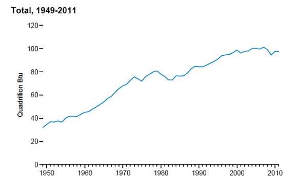
- Our primary energy consumption dropped 2.2 quadrillion BTUs (quads) , or 2.3%, from 2011 to 2012. This is down from the peak of 101.5 quads that we reached in 2007. (See graph below from the EIA 2012 Annual Energy Outlook.)
- Residential energy consumption dropped from 11.4 to 10.6 quads.
- Wind and solar are both up, though both are still a small part of our total energy production. Wind now makes up 1.4% and solar 0.25%.
- Nuclear energy is down from 8.26 to 8.05 quads from 2011 to 2012 because four plants have shut down.
- Petroleum is down about 2%.
- Coal is down a whopping 12% in just one year.
- Natural gas is up 4.4%.

Residential site vs. source energy
Another really interesting bit of information you can get from the chart—which the EIA charts don’t give you—is the breakdown of electricity consumption by site energy and source energy. If you’re up for it, let’s do a little bit of math to see how it works out:
Residential electricity consumption – site: 4.69 quads
Residential electricity consumption – site: 4.63 quads (adjusted to exclude amount from imported electricity)
The total amount of energy that went into generating electricity in the US was 38.1 quads. That’s our total source energy for electricity. The amount of that distributed to the three end uses (residential, commercial, and industrial) was 12.4 quads. Residential makes up 37.3% of that (4.63 ÷ 12.4).
Those 12.4 quads distributed, however, came from 38.1 quads of source energy. Using the percentage we just calculated, we can find the amount of residetial source energy consumption by multiplying the residential fraction (0.373) by the total amount of energy used to generate electricity (38.1 quads).
Residential electricity consumption – source: 14.2 quads
There it is. It takes a little more than 3 units of source energy for each unit of site energy that we use in our homes. That’s the origin of the multiplier effect I wrote about a while back, which means that for every 1 kilowatt-hour of electricity you save at home, you save 3 kilowatt-hours of energy that went into the generating plant. (Of course, that same ratio applies to site vs. source energy used in the commercial and industrial sectors.)
Note that the ratio of source to site energy I calculated here is applies to our total electricity generation in the US. It includes all of the fuels shown above leading into the electricity generation box in the diagram. Your ratio is probably different because it will depend on the actual mix of fuels used in your area. David Butler posted a link in the comments below that shows source energy factors by region and fuel type (pdf).
And there’s so much more information in these diagrams. A person could get endless hours of pleasure by studying these data! It’s probably wise to do so in small blocks of time, though, so as not to overstimulate yourself.
And a sad note…
The US EIA has been publishing the Annual Energy Review for quite a while. It’s a great look at how we use energy. Unfortunately, they announced earlier this year that because of budget cuts, they’re suspending its publication for 2013. This applies to the Energy Perspectives publication as well. See their April 2013 press release for more information.
Related Articles
The Electricity Multiplier Effect for Home Energy Efficiency
US Energy Flows — Inputs and Outputs 1995 to 2010 (about the US EIA diagrams)
This Post Has 5 Comments
Comments are closed.

Here’s a report from NREL
Here’s a report from NREL that provides source energy factors as of 2004: Source Energy and Emission Factors.
See Table 2 for electricity by region, and Table 5 fuel, including delivery costs for LPG, fuel oil, etc. Keep in mind that regional electricity factors often don’t reflect a given utility’s generation mix.
If anyone is aware of a more recent study, please share!
A lot of info, even for those
A lot of info, even for those In the know, the rest of us simply go with the low flow!
A little “fine print
A little “fine print” on the LLNL graph – I’m pretty sure the 38.1 quads of source energy for electricity do not account for “pre-combustion” energy…that is, the amount of energy it takes to extract, process and transport fuels to the power plant. For instance, I was just driving through West Virginia. It takes a lot of energy to blow up mountains, dig up the blown up mountains, sift out the coal, “dispose” the coal slurry, truck the coal over to the rail cars, and send the coal over to the power plant. The LBNL report that David Butler pointed to shows that we should add about another 5% (1.9 quads) to the electricity generation source energy to account for this pre-combustion energy, and back those 1.9 quads out of the industrial and transportation categories. This kind of accounting gets pretty complex, though…that’s probably why the LBNL report (using 2004 data) has not been updated since!
Similarly, if we wanted a more accurate accounting of energy used in buildings (commercial and residential), we should back out some amount of energy from transportation and industrial to account for building materials extraction, production and transportation…not to mention the fuel used by me(!) to transport my blower door to the fine builders who use my services.
David B.:
David B.: Thanks. When I was writing the article, I meant to point that out. When you read it, I didn’t have that caveat in there, but I did add a paragraph later, with a link to the NREL report you provided.
Dennis B.: If you say so… ;~)
John S.: Yes, you’re right. The energy for the coal mining and gas drilling and PV manufacturing would show up under industrial. For imported sources, like petroleum, it mostly wouldn’t show up at all. But even with the gas you use to transport your blower door, you haven’t included everything. What about the fuel to make your blower door or your truck? What about the fuel that powers you – food? What about the fuel that went into producing the food? As you say, it does indeed get complex.
A lot of folks in the peak oil movement talk about EROEI – energy returned on energy invested and try to do the kind of full accounting you mention. A hundred years ago, oil had an EROEI of about 15 or so. For each unit of energy you put in, you get about 15 units of energy out. The number is a lot closer to 1 now because the easy oil is mostly gone.
Of the world’s big economies,
Of the world’s big economies, Germany has shown over the past 20-30 years that energy use and economic strength do not have to be coupled. Between the years 1990 and 2010, the German economy grew by ~30%, while source energy use dropped by ~5%.